While researching for Preretrospect I stumbled across Stem to Steam. A) it's awesome B) How have I not found out about this before??. There's currently talk in the US about how STEM (science, technology, education, mathematics) needs to be turned into STEAM (add A the art). Innovation as grounded in art and design is being revealed here and there in the world. Visit the STEMTOSTEAM website HERE to find out more/get involved.
Saturday, 7 April 2012
STEM TO STEAM
While researching for Preretrospect I stumbled across Stem to Steam. A) it's awesome B) How have I not found out about this before??. There's currently talk in the US about how STEM (science, technology, education, mathematics) needs to be turned into STEAM (add A the art). Innovation as grounded in art and design is being revealed here and there in the world. Visit the STEMTOSTEAM website HERE to find out more/get involved.
PRERETROSPECT #11 ARTIST INSPIRATION
I forced myself to have a hiatus from Preretrospect to try and gain a fresh perspective on the project. As can be seen in previous posts, I had essentially reached a brick wall. By spending a couple of weeks doing small projects, catching up on reading/exhibitions, and helping out with unrelated projects to my own work, I successfully induced the 'shower effect'. I'm not sure if that is a legitimate psychological term, but I use it to refer to the way in which distraction by mundane/unrelated activities clears your mind - often leading to the solution to a problem you were stuck trying to solve. Apologies if that is academically incorrect. But before I post about the breakthrough itself, and the work that has since proceeded it, here are some of the contributing artists/exhibitions/books which helped me get there.
JOHN MAEDA
John Maeda is a world-renowned graphic designer, visual artist, and computer scientist at the MIT Media Lab. He is one of those influences which you are never content knowing enough about. Especially as I am a firm believer that you should always try and uncover what inspires those who inspire you. What has been the main connection to Maeda for me is the way that his work is also heavily based on the process, science, mathematics and data. However all of his work ends up being visually interesting and aesthetically pleasing. As I was finding myself getting so caught up in the theory behind Preretrospect, it really helped finding someone who continually managed to bring back their work to a visual place. He helped restore my faith a little. Check out Maeda's work HERE.
JOHN BALDESSARI
In particular Baldassari's, California Map Project, 1969, really resonated with me. Here Baldessari re-visualized the landscape based on a drawing that we all know and recognize - a map of California. There are two different versions of place represented. He also meddles with the land to create his letters which are so far from the original scale of the map "alphabet," it can't help but be seen as comical.
NEAL FREEMAN
Left: Identically Named Places Connected (USA). All identically named places (cities, towns, village) in the United States connected by a line.
Right: United Kingdom, Centered. All of the units of the UK Census (output areas), horizontally and vertically centered. Commissioned by Northampton Arts as part of the exhibition "Census and the art of capturing data."

Above:
1-3
All the Streets, Centered. All of the streets in selected cities, horizontally and vertically centred.
1) New York 2) Chicago 3) Los Angeles
6) Skyscrapers over 100m connected in height order. Chicago, 239 buildings, tallest: 442m.
5-8
Public Schools in Order, 2006. Straight lines drawn between public schools in numerical order.
5) Queens, 167 schools, 2 - 226 6) Staten Island, 41 schools, 1 - 69 7) The Bronx, 144 schools, 1 - 396 8) Brooklyn, 241 schools, 1 - 811
Slightly frustratingly I only came across this work by Freeman in the last few weeks. Although both our work has created these net like images there are differences. The obvious one being that my work is focused on mental processes. Whereas Freeman's work that seems visually similar, concentrates on physical places/objects. However, I found the way in which he has manipulated the original data/nets by centering/rotating them to a interesting and refreshing approach. It helped me to look at mine own work past the shapes that the data created.
DAVID HOCKNEY
I went to the David Hockney exhibition, A Bigger Picture, at the Royal Academy without expecting it to massively influence Preretrospect. As it turns out I was wrong. Hockney's collection of paintings entitled Tunnels, is a time based collection. He revisited the same place in Yorkshire at various points throughout an entire year. Keeping the frame the same, and painting exactly what was in front of him. Now although I do not have a year, or even a month that I can dedicate to this piece at present, it got me thinking about time on a smaller scale. for example, if you did the same thing many times during one day, you would still have an obvious contrast due to light levels.
The other part of the exhibition that I was drawn to was Hockney's multiple camera film pieces. I don't think that by splitting up a canvas into multiple ones will add to my work at all, but I shouldn't necessarily limit myself to a singular final piece. A triptych might even work better. Especially when you consider the past, present, future element to this project.
aMUSE MAGAZINE - JONATHAN SAUNDERS SS12
As mentioned below, the pisces illustrations done for aMUSE magazine's horoscope page could not be used. However, as they had gone down so well with the office, I was approached with the offer to produce an illustration for the beauty page instead. This had to be based on the make up from the Jonathan Saunders SS12 show.
I can't say that portraiture is an area I'm overly familiar with. But I thought it would be good experience/challenge to see what I could come up with. Below is the final outcome. It has been produced entirely with black ink, watered down into different concentrations. I was fairly happy with the result - but still slightly unsure as it was so out of my comfort zone. As it turns out the editor loved it, and there are now talks about it being a monthly commission for the magazine. Pretty excited!
aMUSE MAGAZINE - HOROSCOPES
I was recently asked by aMUSE magazine to produce illustrations for their horoscopes page (see below for more info). Having worked with one of their team before on illustrations for Borough Market, I knew the type of imagery they were after. Below are the 3 illustrations I did as examples for Pisces. They went down a storm in the office, but unfortunately the publisher pulled the whole page. Something else came up though - will post the finished result once it's done.
aMUSE London is a brand new free high-end fashion/beauty/culture title for women launching mid April 2012. With a monthly circulation of 120,000, it will be distributed at selected London transport hubs and in key London shopping destinations. aMUSE is published by aMUSE Media and founded by Stephen Murphy, former founder & publisher of luxury lifestyle title Square Mile Magazine. The Editor is Sasha Slater and her deputy editor is Stephanie Hirschmiller.
Just to clarify - the colour one is deliberately not matching to give the team more options.
Tuesday, 13 March 2012
TESS PARKS - MUSIC VIDEO
The multi talented and ever delightful Tess Parks has asked me to create a music video for her. I pretty much have free creative control over the project. We're still in the bouncing ideas back and forth stage, but so far so good. Check out her blog HERE - I think I'm actually featured at some point.
NICOLA BRINDLE - VEGAS WEDDING
I've been employed by my friend Nicola Brindle to help her finish everything off for her womenswear collection. The first request was to create a visual identity/design to help tie everything within her portfolio etc together. This is what I came up with - she loved it. I'll try and get some pictures of how it ended up being used.
We've also been brainstorming photo shoot ideas. Now we need to work out which ones are actually realistic and doable.
Thursday, 8 March 2012
EYE FLIRTATION
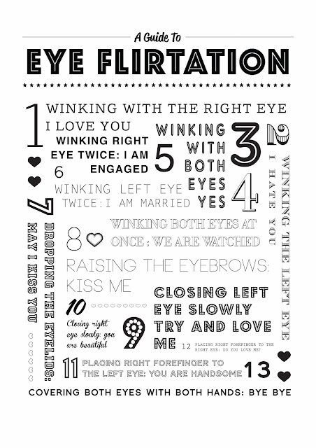
To raise money for both the Illustration Work In Progress Show, and the CSM BAGD Degree Show, we've been holding zine/print sales at uni. My contribution for this was the top typographical print, based on the image above which I found years ago. The actual print has been screen printed in some delightful 90s colours. I'm talking hot pink gradient into orange, 90s sunset style. I still need to get a decent picture of it. But once I do I'll upload it.
Also, this has inspired another project for me. I haven't quite got the proposal smoothed out yet, but it is very nearly there. I'm pretty excited about it. Will be good to have a change from the Preretrospect one.
Subscribe to:
Posts (Atom)


